Posts

my own magazine cover

Image
One thing I am pleased with on my magazine is  the way it is formatted because it looks like a magazine stray kids fan would love to look through.    If I did this project again, I would change the background because it doesn't look  good with the photo of them and the background   

magazine cover

Image
 1. the image is of a 8 member K-pop  group called stray kids because i like their  music and their choreography .  2. the purpose of this image is to show people that they a diverse group. to also show that they are winning awards. Another purpose of this image is to get the audience to listen to Korean music .  3. it will have a positive impact because the audience will see that its a award winning group and they might be interested.    

magazine project

Image
    this magazine cover is very eye catching to people who want to buy magazine covers about specific brands like this magazine cover is about a brand called "Elle" and on the cover is a person modelling for the brand and basically promoting it. in this image 

Recognising Magazine Conventions

Image
  Masthead the title of this magazine is stray kids . the font is sans serif  , which is in big text , this suggests that the magazine may be very interesting . the colour of title is golden which tells the readers that the magazine is very important to buy.    Featured Article Cover Lines Puff Pieces Banners Price/Issue/Sell lines
Image
the first 

magazine cover

Image
1. Who is the magazine for? the magazine is for adults who are interested in daily news about famous people . the magazine cover and the texts on the cover make it seem very interesting to the readers and makes them want to read it. 2. What is the magazine’s goal? the magazines goal is too make the cover very interesting and colourful so it makes it seem like a very good magazine for people to read and so that people can spend their money reading this magazine. 3. Pictures and Design the pictures on the magazine is telling us that the magazine is about the royal family and about peoples daily life. I think they chose this as the front cover to show a summary of what the whole magazine is about. the colours make the magazine cover very colourful and look more fun to read 4. Words and Headlines the words on the cover make the readers more interested in reading the magazine . the words on the magazine tell u what the whole magazine is about. 5. What’s happening in the world? the magazin...

Denotation and connotation

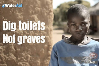
Image
  1) Write an analysis of the  WaterAid advert above  using denotation, connotation and analysis. What can you see? What are the deeper meanings in the advert? What does the advert communicate to the audience? How might an audience react after seeing the advert? Denotation:  what do you see? I see a picture of a little boy who looks sad and I see a brick wall behind the wall . on the advert there is a text that says " dig toilets  not graves" . which may suggest that they have no money and that their poor. Connotation:  what is suggested? What does it mean? the advert is suggesting that the audience should feel bad for the little boy and to help donate money so that they can help the people in need of money and life necessities . Analysis:  what is the effect on the audience? How is this effect created? the effect on the audience is to guilt trip them and make them more interested to the advert . 2) Now choose your  own choice of advert  from...